Snapshot
We redeveloped his identity from his Etsy site and created a new e-commerce site, along with a logo, style guide, target customer segment, and print materials.
Strategy
Working directly with the client, I always try to understand their goals and needs are before starting anything. The client’s mission for his company, Refated Shoes (RFS) is to repurpose and redesign older shoes. Although it is a sustainable business model, the client chose older shoes because he preferred the canvas they provided. He also viewed this as an art form rather than strictly a business, so revenue wasn’t his ultimate goal.
He wanted a “fresh, cool, and bold” look to his brand, which translated to a modernized mixture between a Wild West saloon and an upscale English gentlemen’s club.
There was a lot we had to do in order to get to where we wanted. To get started, I needed to answer these questions.
- Where should we host the e-commerce site?
- Who were our potential buyers and fans?
- How do we utilize social media marketing?
Research
I wanted to get a better understanding of the market, so I started by researching his competitors. I quickly learned that there were quite a few similar companies, with ranging services. For instance, while RFS offered one-of-a-kind shoes, other competitors were creating custom handmade shoes with custom refinishing services or just creating shoes that looked as if they were refinished by hand on a large scale. Some details include:
- Price point: $300-$1,000
- Design aesthetic: craftsmanship, old school feel
- Marketing: social media
Most importantly, we had to better understand his
current and potential customers. We ran three different
surveys, each narrowing what we wanted to learn:
- Who the customers are
- What would compel them to buy this product .
- And at what price point
With more than 130 respondents, we were able to answer these questions.
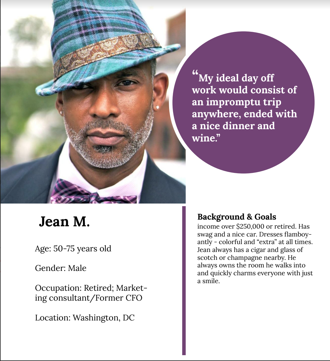
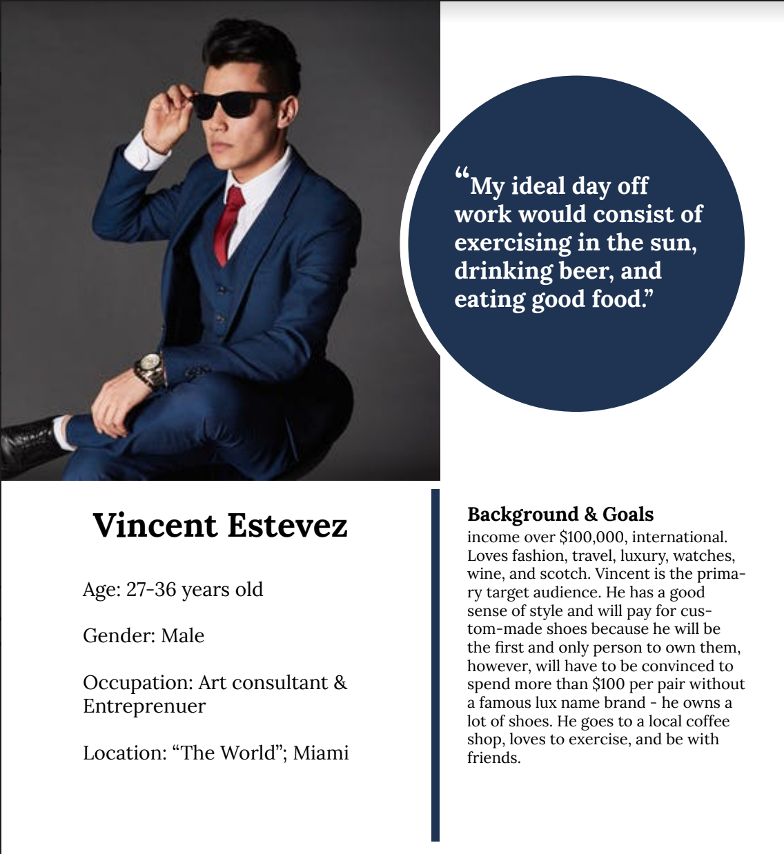
Target Customers
The customers fall into two age groups: millennials
and early baby boomers/ traditionalists. We could break
the millennials into more specific groups:
- wealthy and art-loving entrepreneur
- freelancer working from a coffee-shop
Click on the images for a little more detail on two of the personas:
Content
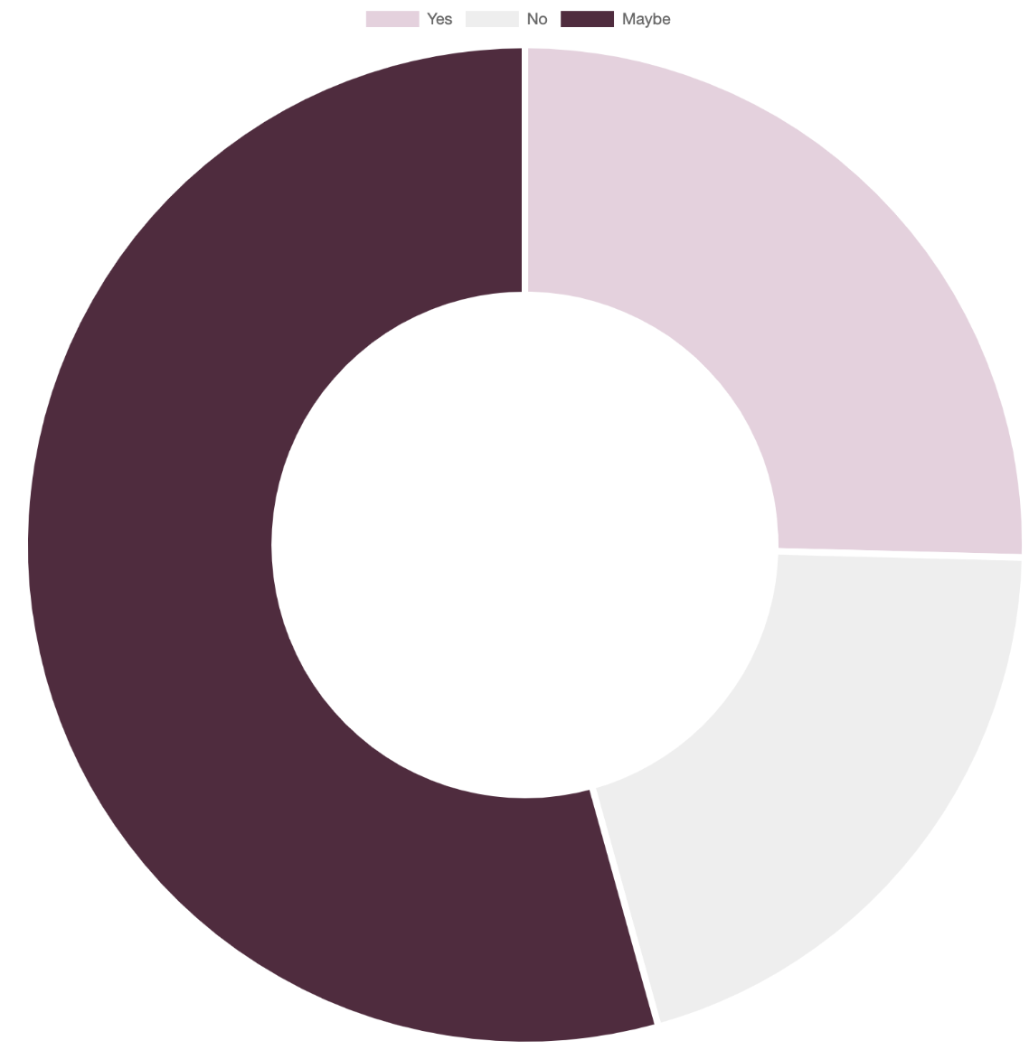
We quickly learned that potential customers weren’t fans of certain terms we chose for the product description. More specifically, the word “refurbished” elicited negative reactions from 51.5% of respondents. We tested new words and decided to go with “hand-dyed”, which decreased the “no” responses to 20.3%. These results are taken with a grain of salt since we did not test with the same respondents. However, the overwhelmingly positive response to “hand-dyed” convinced us to move forward with the new term.
Would you purchase refurbished shoes?
Would you buy shoes that were hand-dyed?
Price Point
Starting off, the client wanted to price his shoes lower than his competitors since they weren’t custom shoes. My initial reaction was to disagree since art is usually at a higher price point. Competitor pricing started at $300, with some shoes priced more than $1,000.
From our surveys, we learned that respondents who would pay between $100-$300 for a pair of shoes, 50% of them would consider buying refurbished shoes. While more than 52% of respondents who would pay $50-$100 would or would consider buying refurbished shoes.
If the client had more resources, we could have conducted more desk research and focused on the targeted respondents to get a better price point. However, he wanted to price his shoes from $75-$250, leaving the door open for a higher price range once he felt more established.
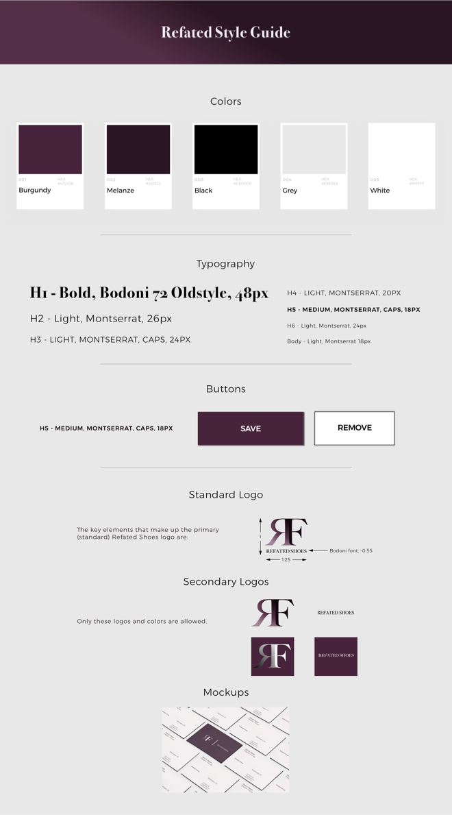
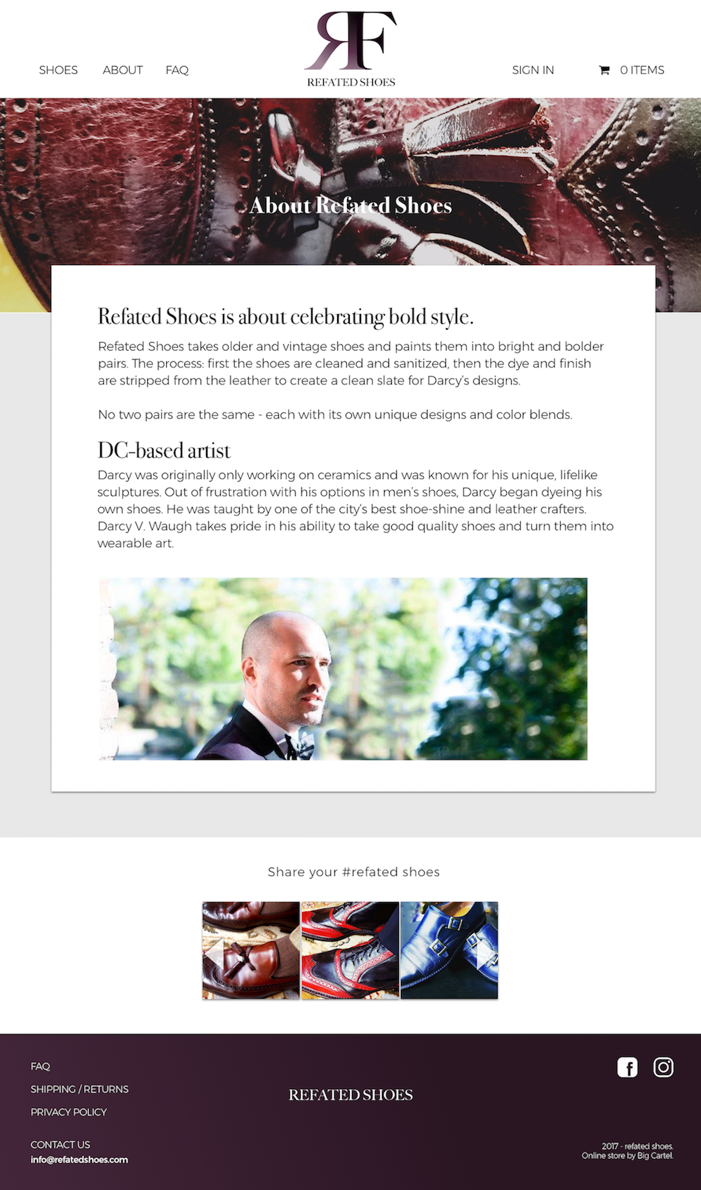
Branding
The client wanted this to be a representation of himself and his tastes. As he was discussing this, he was covered in burgundy - wool coat to boots. It was clear, we needed to add burgundy to the mix - potentially some dark green as his special request.
His desire to mix Wild West saloon and gentlemen’s club shouted a serif font, but I couldn’t figure out whether he wanted it to be more modern or traditional, so I played around and presented these logos:
We ultimately landed on these:
Once the logo was set, the style guide came easy:
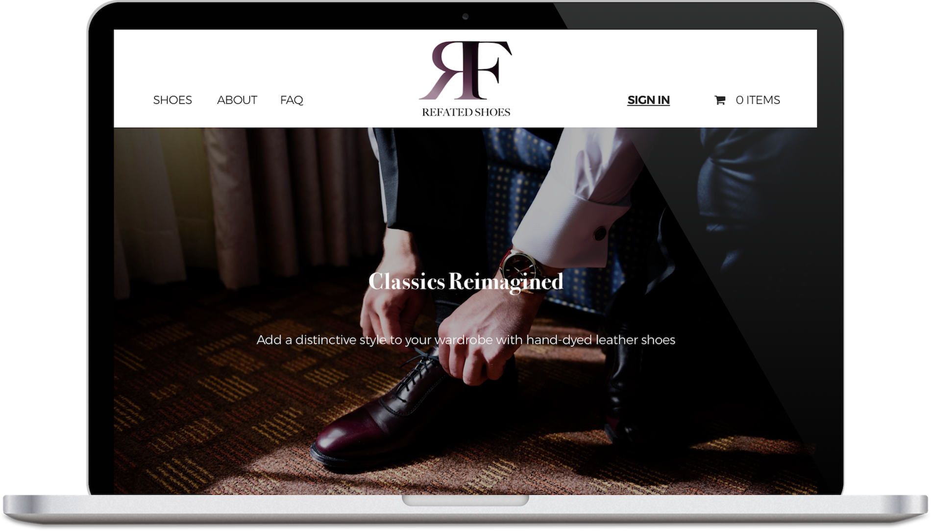
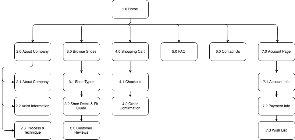
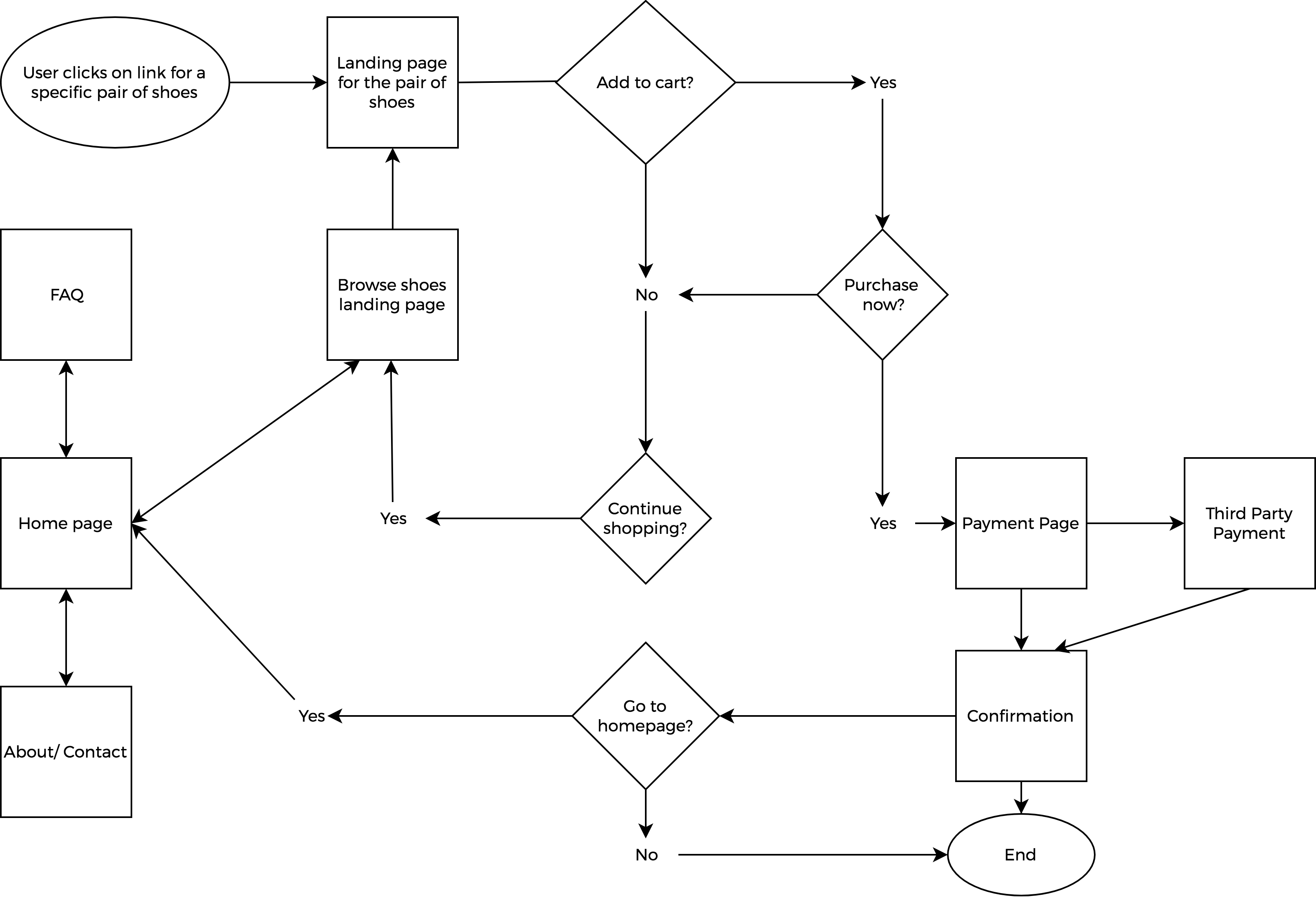
Website Design
Information Architecture: Since this is a unique product, we wanted to avoid any potential confusion and frustration, so we sought the help of testers through a card sort that informed our site map. Based on our user personas, we decided to target millennials through Instagram, while the boomers would learn through word-of-mouth. So, our user flows mainly focused on clicks through Instagram.
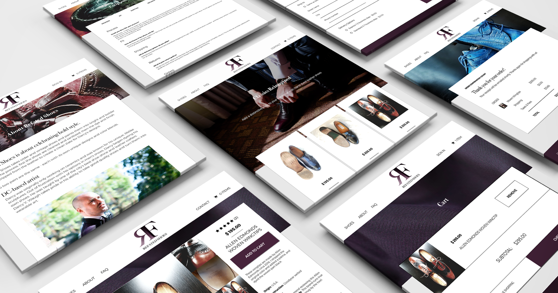
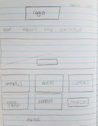
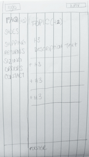
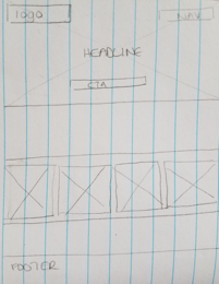
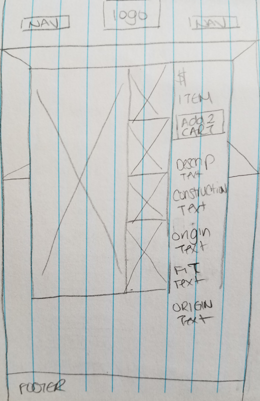
Sketching to LoFi:
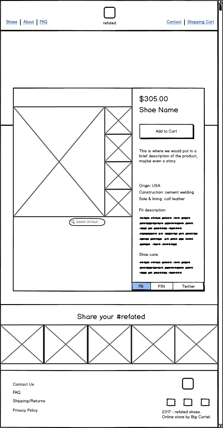
Prototype & Test
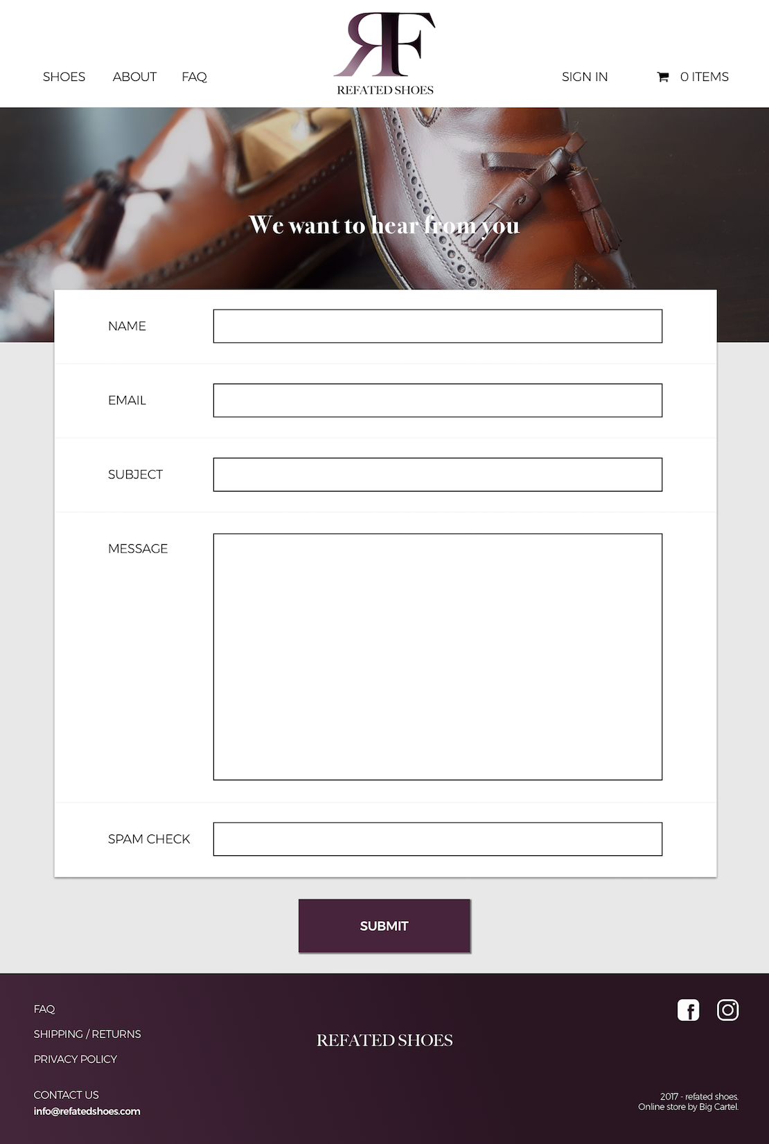
The main feedback we received:
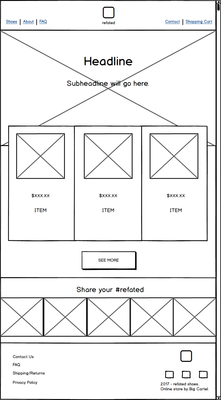
- Upgrade our quality of photos.
- Include a section that described the process and some before
and after photos.
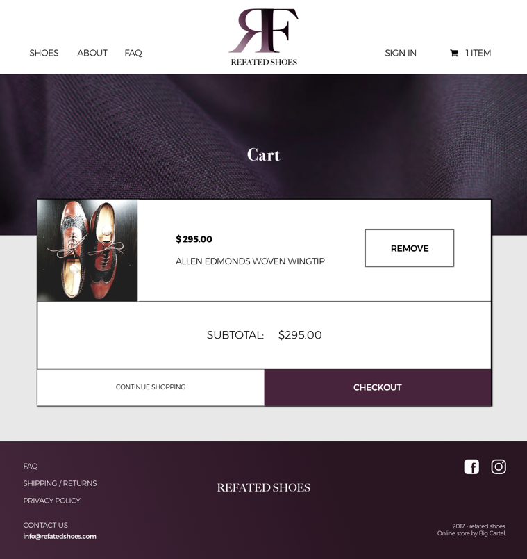
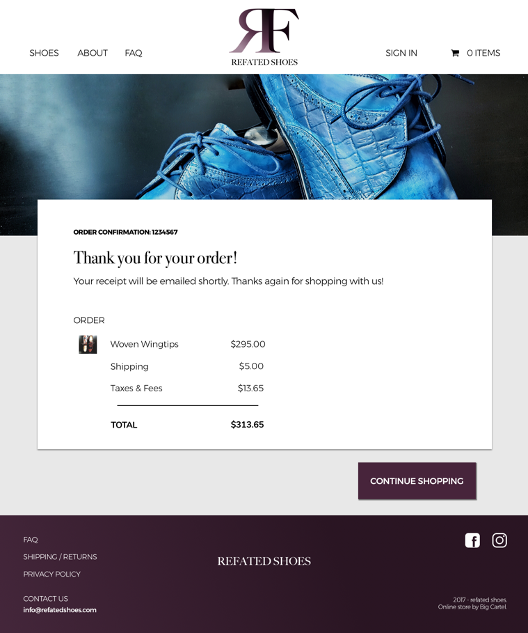
- Remove the quantity part of the shopping cart. There's
only one of each product!
Finalize & Present
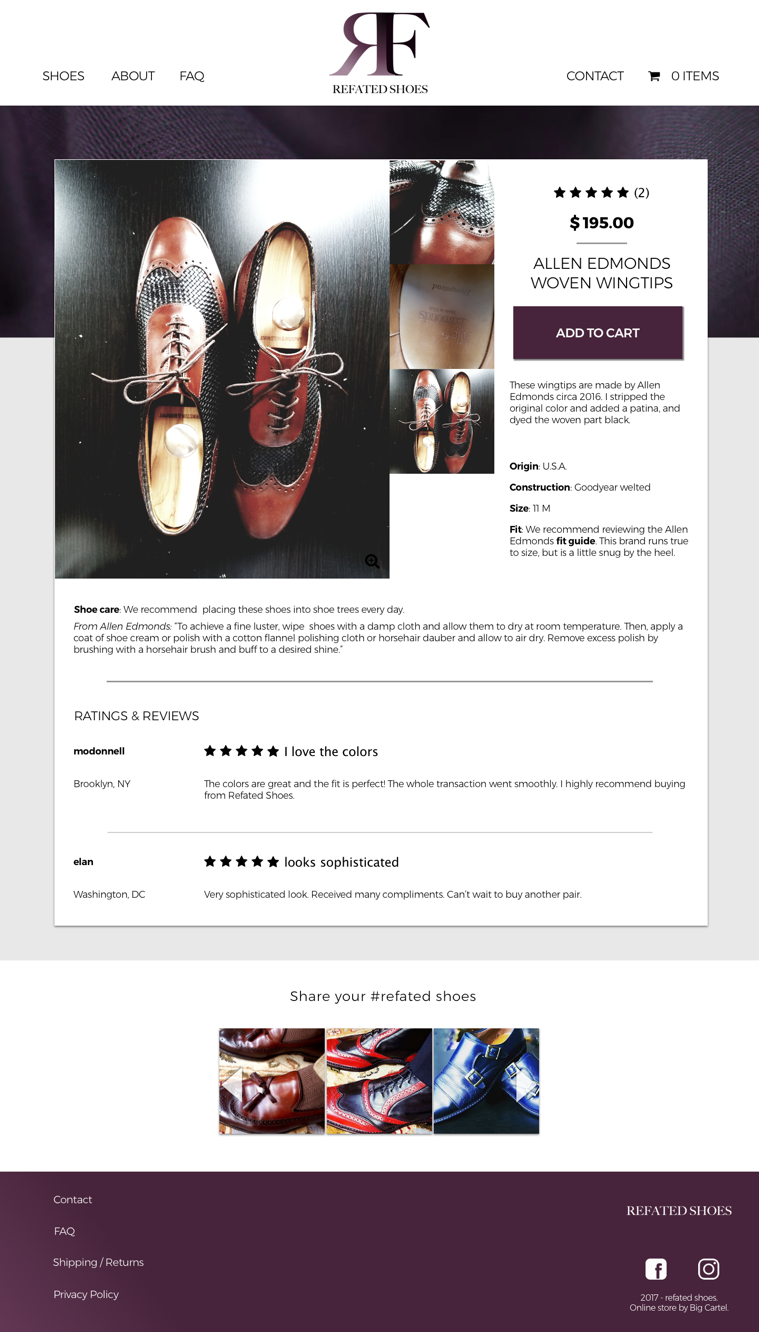
Learnings
A/B testing is a great way to snap out of autopilot. While I was designing the shopping sections of the site, I designed the pages for a typical e-commerce site: the browsing page, the product details, adding to cart, and checkout. However, a tester quickly pointed out that if these items were truly unique, as we stated throughout the page, then why was there a quantity button? Just because I was working on an e-commerce site, doesn't mean it followed every single e-commerce page. It reminded me that no task should be on autopilot and developed a greater appreciation for user testing.
Check out other case studies.